 Browsing through the new Lightroom reveals a variety of new features. New organization implementations and an improved RAW rendering and de-mosaic algorithm are major announced features. Adobe Labs has posted intro videos that are worth browsing for details. Allowances need to made as this is a beta but by any other name, it has a
… Browser!
The third major version of Adobe Photoshop Lightroom is now in the pipeline. Adobe has announced the beta evaluation period will not be as long as LR 1.0 was at over a year, but it will certainly be longer than LR 2. Adobe has chocked this full of lots of little improvements and details that viewing the aforementioned videos at the Adobe Labs website makes a requirement. Some new additions and changes I would not have otherwise discovered.
Architecture
It is noticeably faster, even for a beta release for testing purposes. There are several tool advances and usage streamlining in this new architecture. New metadata and search features when demonstrated have a definite application but, are some overkill? The workflow concept from Adobe is advancing based on real experience, yet how long will the learning/upgrade curve be to fully use this product in a new version? It took me several attempts to fully integrate with LR1, and yes then I was sold, but it wasn’t overnight and not entirely intuitive. I still have to stop and look up some things to make them work ‘just right’. Now I may be facing another several week period of such activity.
This beta installed cleanly and transferred catalogs without a hitch. My camera profiles are popping up where they are needed.
The ACR rendering improvement implementation is not noticeably impressive, yet. I have run about 50 photos off as test prints and it is a marginal improvement at best. I do my print workflow outside of LR so I may have stepped on something. The side by side type comparisons from LR2.5 to this beta don’t show me much. More testing and evaluation is warranted
Tools
Tool advances include nice touches like targeted adjustment tools turning off when you leave a particular panel or tool section. No more having to ‘put them away’ before going on to other adjustments. Finally!
There are changes and advances with the Display tools including eliminating the ‘basic’ adjustment panels for such items as the Gradient tool. The previous advance panel is now the standard and Adobe does give us a better way to do global adjustment. It is similar to the targeted tool and works by moving the mouse left and right.
Sharpening and Noise reduction changes are quickly apparent when working with higher ISO files. Again, it is recommended to view the intro videos for the basic concept of what to try and experiment with to evaluate what is now offered.
B&W and Grain
New B&W modes for conversion is surely a direct response to user inputs of the past. The Grain panel leaves much to be desired and is very basic. The results are not too bad if apparently currently limited.
New Input – The Browser!
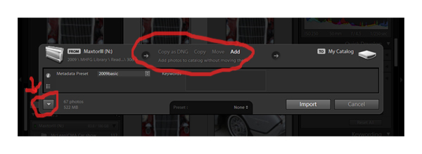
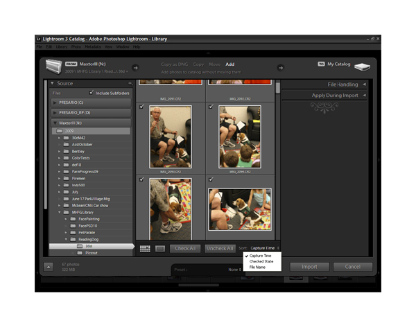
When I hear terms like “The New Input Experience” a bad reaction usually ensues. Not so with Lightroom 3. The first screen snap crop below with the red circles is what now pops up after activating the big Import button. The screen underneath fades and this pops up with several choices ranging from convert to DNG to the basic and often used Add which is highlighted. The lower left red circle highlight an expansion or ‘More’ feature that finally opens, yes I’m liking this, a Browser type functionality. It quickly pops up a list of your drives and directories (on the left in the second screen shot) that you can just drag the the cursor over to select. And then it will display the images, including RAW, in each directory.
The initial pop up Input window of the browser implementation. (click on images for large size)
The open Input window including a mouseover window with sorting options in the lower center.
Lots of new features are not mentioned in this overview. This includes the greatly augmented number of search, tagging, and various metadata features that will require some time to see how usable they are in real use. Watermarking will receive many comments on what needs to be fixed. The Web interface has Flash and HTML functionality, but I still want to see a more flexible output for any site other than just Flickr or the like.
Adobe in this beta for what will become Photoshop Lightroom 3, has displayed a lot for thought and evaluation. Remember this is a ‘trial run’ and not the final product. Lots will change and my initial overview is just that, only a start.
If you choose to download and evaluate this beta, please be sure to post comments to Adobe via their user input web pages and share some of your thoughts, ideas, and concerns here too.
Adobe Links
Adobe Web Page
Adobe Photoshop Lightroom 3 Beta Page >>
Adobe Photoshop Lightroom 3 Beta Videos >>
Adobe TV for Lightroom Products - The Videos
Adobe Labs Forums Lightroom 3
Related Content
Adobe Software News
Adobe Software User Reviews
Workflow Software Reviews
Photography Software & Post Processing Forum


Thanks for Lightroom 3 beta overview, DRG. I haven’t had a chance to look at it yet and your article gives me a good idea of what to expect. You didn’t say what you thought the best changes/additions are. What is your favorite new feature in the beta? After trying it out, would you say you’re looking forward to the new version? Have they improved the browser and processing performance?
Good overview, DRG. I’m happy for two things most. Faster peformance and improved RAW conversion. I’m amused in a way about the grain feature. As we strive for the cleanest and most impressive IQ from the latest gear race we also want to then throw some grain at it. I’m one of them! i was wondering when a photography geared editing program would give us some good old grain without having to jump back into PS for it.
The browser as currently implemented is for me the big standout feature. Lightroom becomes more flexible in choosing what images to add/import/convert as the selections can be made visually. Known ‘clunkers’ from shoots or when for example I fire the camera at my foot or the wall don’t need to be imported and then immediately deleted.
I am getting a few photo samples together for display. Some higher ISO images I have run through it do improve over LR 2.5 in areas of noise if the processing is set up correctly. Still not finding a noticeable difference in the de-mosaic improvements as advertised. Most likely the images being selected are not displaying much problem to start.
Lots and lots of little features about tagging, and marking and sorting that may add up to a significant improvement. As I am used to the ‘older’ version and have adapted most as of yet don’t seem to make a difference. There are some newer ways of selecting sets of images that will have an impact. Particularly with different cameras and or lens combos and end file sizes.
More updates. Also see the forums at http://forums.photographyreview.com/forumdisplay.php?f=61
Upon detailed inspection, only a portion of my combined catalogs actually became available upon installation. Nothing else can be installed on the 32 bit XP machine. 64 bit machines (i.e. Vista) didn’t import any catalogs, but no other file import problems have occurred. This is kind of a minor annoyance with a beta, and thus far I can find files with the browser based upon my directory and drive naming conventions to use for testing.